Sugerman’s Solutions
Beachfront Living Room

A Miami Beach native and Georgia Tech graduate, Barry Sugerman, Architect, A.I.A., has been practicing architecture since 1965. Sugerman’s work is widely published in local and national magazines, and he has won more than 150 national and regional awards for both new and remodeled residences. These include the “Golden Aurora Award” for a Mediterranean-style residence, judged “best home in the Southeastern United States,” and the “Best in American Living Award” for a modern-style home, judged the “best home in the United States.”

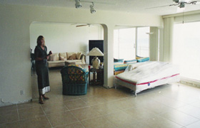
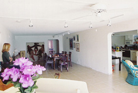
When Barry Sugerman redesigned the kitchen of a beachfront condo, his clients realized that the living room and dining room looked dated and tired next to the newly refaced kitchen. So “Sugerman’s Solutions” continues with Phase Two, remodeling the living and dining rooms that are adjacent to the kitchen and providing more storage space, an important element in the redesign.
Problem: A structural column was located in the middle of the opening between the living room and the dining room. Removing it would be very costly – in excess of $25,000 – since the apartment was on the third floor of a four-story building. In the judgment of Sugerman, the money would not be well spent. His solution cost significantly less.
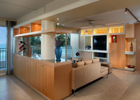
Sugerman’s Solution: Keeping with his motto of “If you can’t hide it, play it up big,” Sugerman wrapped the floor-to-ceiling 12″ x 12″ column, making it a 16″ round column. The clients remarked that this seemed like making a small impediment into a much larger one. But Sugerman had only begun dealing with the intruding column. He designed glass shelves that were held up by a wood frame and two wood fins that cantilevered off the column for a dramatic effect. Above he built a light soffit, illuminating through the shelves and on to the granite ledge below. On the dining room side, this ledge tops a serving buffet cabinet that provides much needed storage. On the living room side, the cabinet provides a back up wall for the living room couch.
Problem: The couple needed a media/display cabinet in the living room and wanted it to have the same dramatic effect as the buffet cabinet.
Sugerman’s Solution: Using a combination of maple used in the kitchen and dining room and MDF board (which gives the illusion of plaster without the expense and mess), the new cabinet commands the room. Its lighted niches prominently display collectibles and art pieces while housing visual and audio equipment and providing closed storage. Sugerman painted the back wall of niches to create a color feature in the living room.
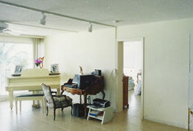
Problem: As often happens, when the kitchen, dining room and living room got makeovers, the family room now looked like an ugly step-sister. The clients want more storage space for larger belongings, but there is another column in the way. The family room is boarded on two sides by featureless walls, with the north wall terminating at the foyer with a 12″ column. The clients fear that additional cabinetry cannot be deeper than 12”. Otherwise, it will stick out past the column and hinder their circulation around the apartment.
Sugerman’s Solution: This called for thinking outside the box or, in this case, outside the column. Entering the apartment, the cabinet is 12″ deep, no deeper than the column. As it extends along the wall, however, it graduates to 16″ deep, then 24″ deep, which is sufficient to house clothes on hangers. The resulting cabinet is 22′ long . To keep it from being heavy- looking, Sugerman included niches to display their art work and a small television set, and by using a smooth plaster-looking material, it fools the eye into thinking that this is more than just a vessel to hide stuff.
See the spectacular results in our Sugerman’s Solutions photo gallery.


